Simple graphics
MATLAB incorporates many powerful graphic tools and can provide visualisations in two or three dimensions, and most books on MATLAB have whole chapters devoted to producing graphics.
Single plots
We will now go through how to plot a simple function in MATLAB and save the figure to a file you can use in a report.
Walkthrough
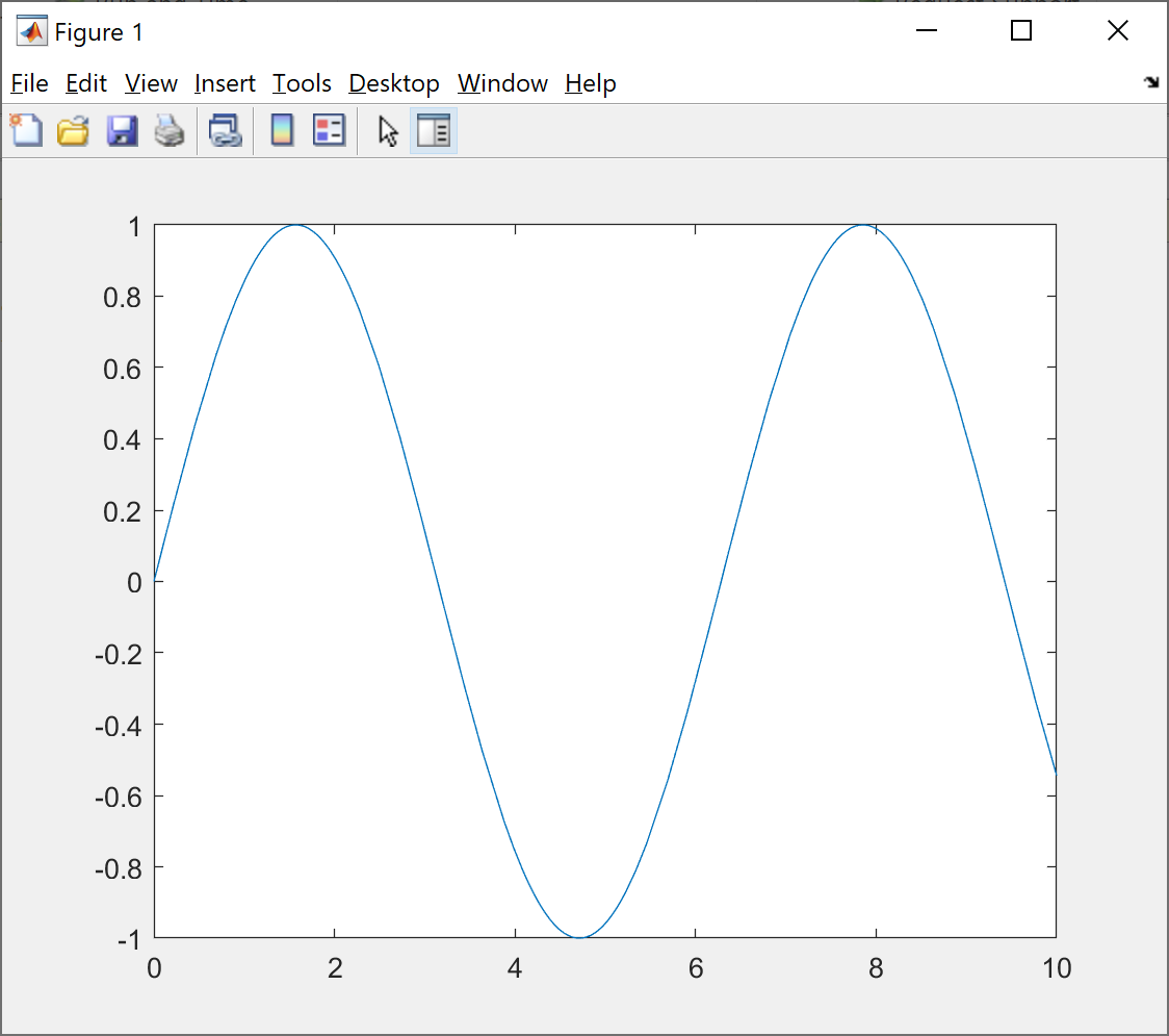
To plot the function $\sin(x)$ for $x$ between 0 and 10 type:
fplot(@(x)sin(x),[0 10])
Here, the notation @(x)sin(x) is referred to in MATLAB as an anonymous function.
It specifies a function that takes x and outputs sin(x).
This gives you the following figure on screen:
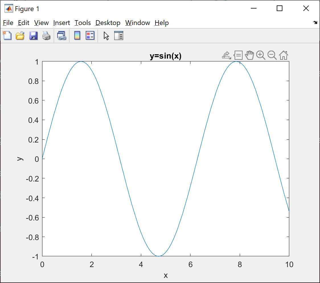
To label the axes and add a title type
xlabel('x')
ylabel('y')
title('y=sin(x)')
which updates the figure as follows:
You can save the figure by clicking on the ‘Save’ icon in the top left corner of the screen.
This will save the figure as a .fig file which can only be opened in MATLAB.
If you want to save the file in a format that you can include in a report, select the ‘Save As’ item in the ‘File’ menu.
You can select the type of file to save as in the ‘Save as type:’ drop-down menu.
The best file type to save the figure as are .eps if you are using LaTeX, a .png or .tiff if you are using something like Microsoft Word, or .svg if you are writing for the web.
The figure produced is given below:

There are also command line commands such as
print ExampleFigure.png –dpng
which will print the currently selected figure to the file ExampleFigure.png. The second command –dpng selects the type of file in which the figure will be saved - try doing this now. For more options see
doc print
To close the figure use the close command.
Multiple plots
You can also include multiple plots in the same figure, using the procedure covered in the following walkthrough.
Walkthrough
To plot two data-sets y1 and y2 against x on the same diagram, use the method shown below.
x=[1 2 3 4 5 6];

y1=[1 4 9 16 25 36];
y2=[6 5 4 3 2 1];

plot(x,y1, '-',x,y2,'--')

xlabel('x')
ylabel('y' )

legend('y1','y2','Location','NorthWest')
The statement plot(x,y1,'-',x,y2,'--') tells MATLAB to plot y1 against x as a solid line, and to plot y2 against x as a broken line.
Note the use of legend to label the lines and the position of the legend.
You could also use the command hold on.
To do this see doc hold for examples.
The text size on the axes and other properties of the figure can easily be altered. There are a number of options available under ‘View’ including ‘Plot Edit Toolbar’ and ‘Figure Palette’ which bring up a number of options as shown here:
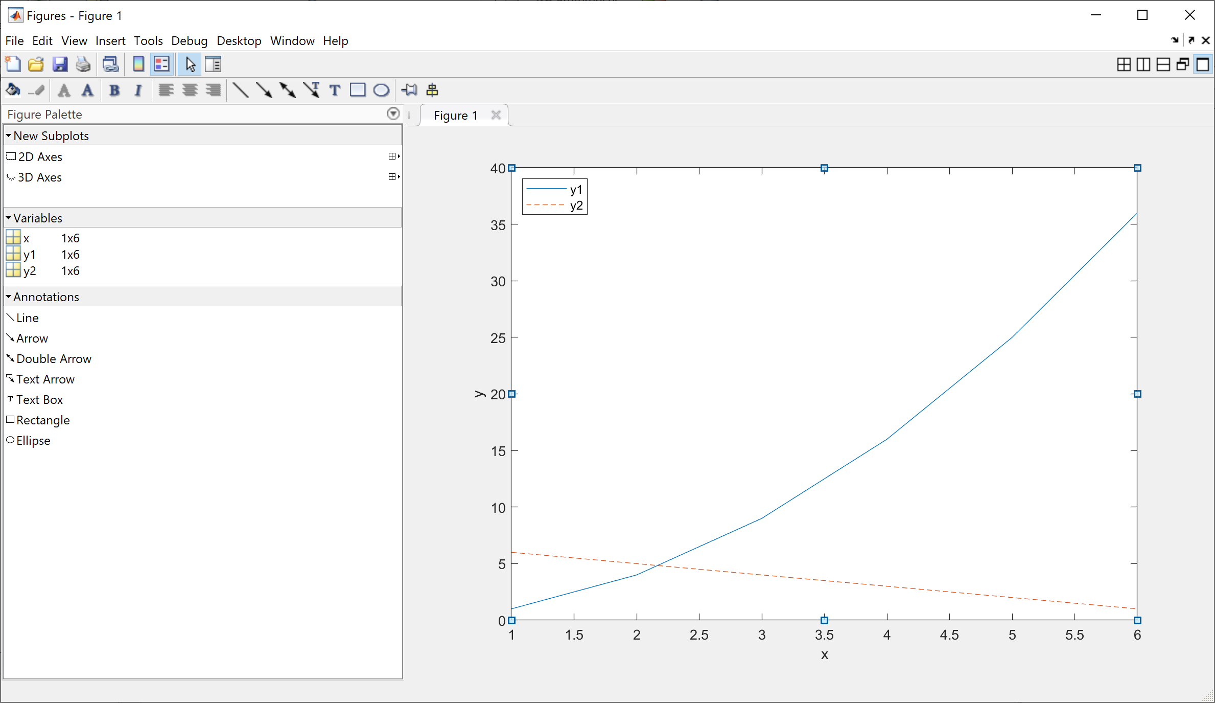
It is very important that the axes and labels on a figure are readable when you use the figure in a report, and you can use the plot tools to ensure this. To change the size of the text, just click on the text you wish to resize and you can then edit the font. All other properties of the figure can be changed using the plot tools.
Subfigures
You can also make multiple subplots in the same figure using the subplot command.
Look it up now in the help files before continuing.
Walkthrough
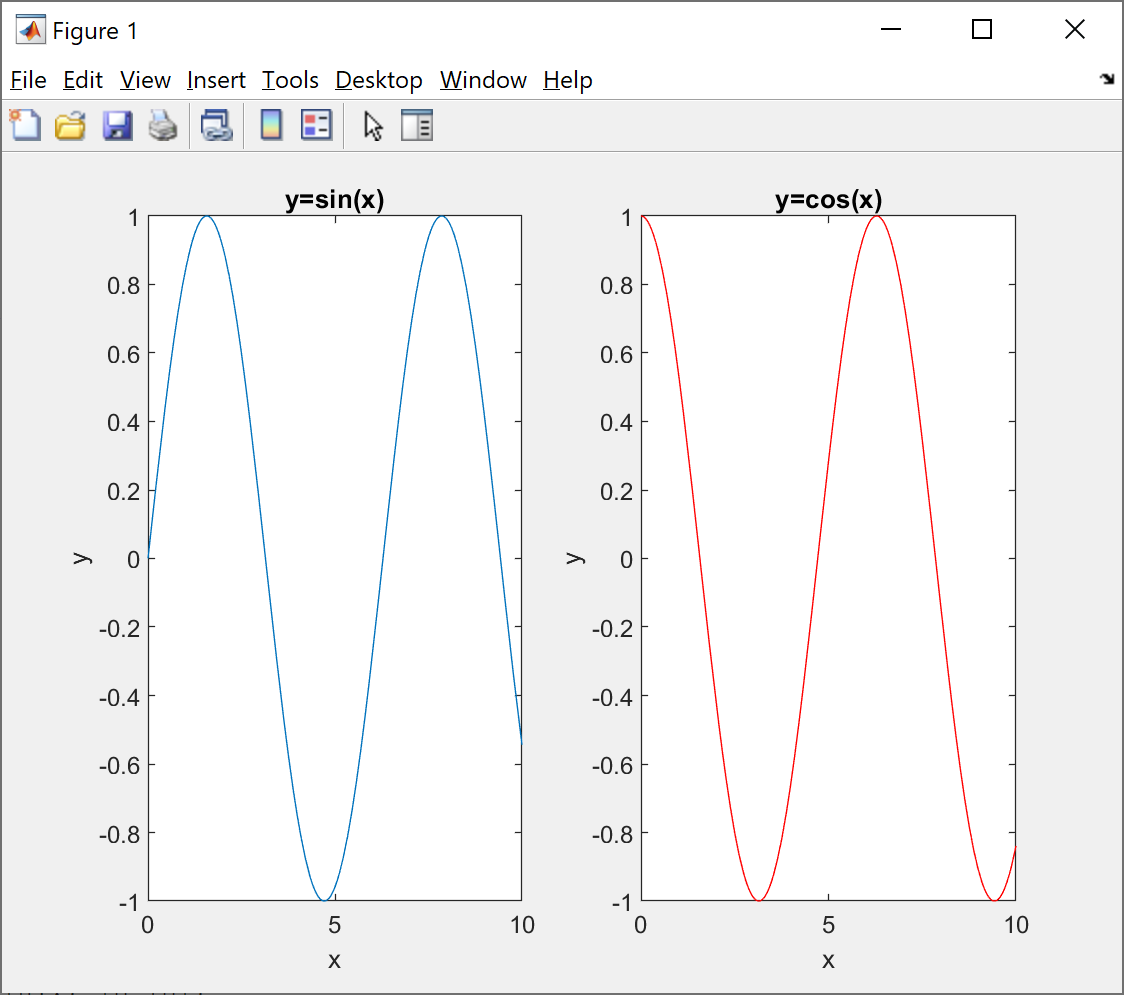
To plot $sin(x)$ and $cos(x)$ in separate plots contained in the same figure we use the following commands:
subplot(1,2,1); fplot(@(x)sin(x),[0 10]);
title('y=sin(x)'); xlabel('x'); ylabel('y');

subplot(1,2,2); fplot(@(x)cos(x),[0 10],'r');
title('y=cos(x)'); xlabel('x'); ylabel('y');
The statement subplot(1,2,1) tells MATLAB to create a grid of 1 by 2 subfigures within the main figure, and the last number indicates in which subfigure to put the next command.
You can change these numbers to get a larger number of subfigures.
You can add labels and titles to each of these subfigures in the usual way.
These commands result in the following figure:
The text size on the axes and other properties of the figure can easily be altered by selecting the options from the ‘View’ menu, as with a single plot.