Scientific Visualisation with Matplotlib
Overview
Teaching: 0 min
Exercises: 70 minQuestions
How can I visualise my data?
What is Matplotlib and what can I use it for?
Objectives
Generate a heatmap of longitudinal, numerical tabular data.
Create graphs of mean, minimum, and maximum characteristics over time from data.
Create graphs showing multiple data characteristics within a single plot and separate plots.
Save a generated graph to local storage.
Write a script to visualise data from multiple data files.
Use a library function to get a list of filenames that match a certain pattern.
The mathematician Richard Hamming once said, “The purpose of computing is insight, not numbers,” and
the best way to develop insight is often to visualize data. Visualization deserves an entire
lecture of its own, but we can explore a few features of Python’s matplotlib library here. While
there is no official plotting library, matplotlib is the de facto standard.
Introduction to Matplotlib (and NumPy)
If you haven’t already seen it, see topic video lecture, and PowerPoint slides used with per-slide notes.
Adding Matplotlib to our Virtual Environment
Similarly to installing NumPy, we also need to install the Matplotlib external library to use it. First, make sure you’re on the Bash command line, exiting Python if needed.
If we need to reactivate our virtual environment we can do:
cd
cd se-day2/code
source venv/bin/activate
And then, to install the package:
pip3 install matplotlib
Matplotlib makes use of a renderer to allow us to view generated graphs and plots as images. The default renderer (‘agg’) isn’t really suitable for this since it doesn’t allow us to view plots as we generate them in Python. So if you’re using one of the provided Ubuntu laptops (or the SABS virtual machine) we need to install another one via the Ubuntu operating system’s package manager:
sudo apt-get install python3-tk
You’ll be asked for the dtcse user’s password. Once entered, and you press Enter to confirm the installation, the package will be installed.
Visualising our Inflammation Data
Using Microsoft’s Windows Subsystem for Linux (WSL)?
If not, you can ignore this! We’re going to be using Matplotlib’s PyPlot
show()function to display generated graphs. However, if you’re using Microsoft’s WSL, you’ll very likely find this doesn’t work, since WSL doesn’t support a graphical interface. We’ll be covering this later, but instead of doing this you can save the graph as an image to the filesystem instead, then open the generated image under Windows.So where you see:
matplotlib.pyplot.show()Instead use:
matplotlib.pyplot.savefig('output.png')Then you can find and open the
output.pngfile under Windows.
First, we will import numpy and the pyplot module from matplotlib and use two of its functions to create and display a heat map of our data (you won’t need the line beginning data = if you’re continuing directly after the previous lesson and already have it loaded):
import numpy as np
import matplotlib.pyplot

data = np.loadtxt(fname='../data/inflammation-01.csv', delimiter=',')
image = matplotlib.pyplot.imshow(data)
matplotlib.pyplot.show()

Blue pixels in this heat map represent low values, while yellow pixels represent high values. As we can see, inflammation rises and falls over a 40-day period.
When we close the generated graph, note that running matplotlib.pyplot.show() again doesn’t show us the graph. This odd behaviour comes back to Matplotlib’s hidden state and is a design decision: show() represents the end of the expected graph creation process and is only intended to be used once. So annoyingly, in order to display it again we’d need to recreate the graph.
Let’s take a look at the average inflammation over time:
ave_inflammation = np.mean(data, axis=0)
ave_plot = matplotlib.pyplot.plot(ave_inflammation)
matplotlib.pyplot.show()

Here, we have put the average per day across all patients in the variable ave_inflammation, then asked matplotlib.pyplot to create and display a line graph of those values. The result is a roughly linear rise and fall, which is suspicious: we might instead expect a sharper rise and slower fall. Let’s have a look at two other statistics:
max_plot = matplotlib.pyplot.plot(np.max(data, axis=0))
matplotlib.pyplot.show()

min_plot = matplotlib.pyplot.plot(np.min(data, axis=0))
matplotlib.pyplot.show()

The maximum value rises and falls smoothly, while the minimum seems to be a step function. Neither trend seems particularly likely, so either there’s a mistake in our calculations or something is wrong with our data. This insight would have been difficult to reach by examining the numbers themselves without visualization tools.
Make Your Own Plot
Create a plot showing the standard deviation (using NumPy’s
std()function i.e.np.std) of the inflammation data for each day across all patients.Solution
std_plot = matplotlib.pyplot.plot(np.std(data, axis=0))
matplotlib.pyplot.show()
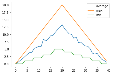
Multiple Plots: Single Graph
Perhaps we want to compare the minimum, maximum, and average plots overlayed together. This would allow us to see the range of values across each day in the trial. Let’s use VSCode to build a script called overlay_graphs.py that positions our three graphs in a single plot, or ‘figure’.
So Matplotlib divides a figure object up into axes: each pair of axes is one ‘subplot’. To make a boring figure with just one pair of axes, however, we can just ask for a default new figure, with brand new axes. The subplots() function returns a (figure, axis) pair, which we can deal out with parallel assignment.
Given we have a stacked set of graphs in a single figure, we use legend() on our axes to add one which uses our given plot labels.
import numpy as np
import matplotlib.pyplot

data = np.loadtxt(fname='../data/inflammation-01.csv', delimiter=',')

all_graphs, all_graphs_axes = matplotlib.pyplot.subplots()

all_graphs_axes.plot(np.mean(data, axis=0), label='average')
all_graphs_axes.plot(np.max(data, axis=0), label='max')
all_graphs_axes.plot(np.min(data, axis=0), label='min')
all_graphs_axes.legend()

matplotlib.pyplot.show()
Multiple Plots: Multiple Graphs
We can also group similar plots within a single figure using subplots next to each other within that figure. Let’s use VSCode to build another script called multiple_graphs.py that positions our three graphs side-by-side and introduces a number of new commands.
The function matplotlib.pyplot.figure() creates a space into which we will place all of our plots. The parameter figsize tells Python how big to make this space.
Each subplot is placed into the figure using its add_subplot method. The add_subplot method takes 3 parameters. The first denotes how many total rows of subplots there are, the second parameter refers to the total number of subplot columns, and the final parameter denotes which subplot your variable is referencing (left-to-right, top-to-bottom).
Each subplot is stored in a different variable (avg_axes, max_axes, min_axes). Once a subplot is created, the axes can be titled using the set_xlabel() command (or set_ylabel()).
import numpy as np
import matplotlib.pyplot

data = np.loadtxt(fname='../data/inflammation-01.csv', delimiter=',')

fig = matplotlib.pyplot.figure(figsize=(10.0, 3.0))

avg_axes = fig.add_subplot(1, 3, 1)
max_axes = fig.add_subplot(1, 3, 2)
min_axes = fig.add_subplot(1, 3, 3)

avg_axes.set_ylabel('average')
avg_axes.plot(np.mean(data, axis=0))

max_axes.set_ylabel('max')
max_axes.plot(np.max(data, axis=0))

min_axes.set_ylabel('min')
min_axes.plot(np.min(data, axis=0))

fig.tight_layout()

matplotlib.pyplot.show()
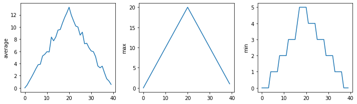
The call to loadtxt reads our data, and the rest of the program tells the plotting library how large we want the figure to be, that we’re creating three subplots, what to draw for each one, and that we want a tight layout. (If we leave out that call to fig.tight_layout(), the graphs will actually be squeezed together more closely.)
Moving Plots Around
Save a new version of the program which displays the three plots vertically instead of horizontally.
Solution
import numpy as np
import matplotlib.pyplot

data = np.loadtxt(fname='../data/inflammation-01.csv', delimiter=',')

# change figsize (swap width and height)
fig = matplotlib.pyplot.figure(figsize=(3.0, 10.0))

# change add_subplot (swap first two parameters)
avg_axes = fig.add_subplot(3, 1, 1)
max_axes = fig.add_subplot(3, 1, 2)
min_axes = fig.add_subplot(3, 1, 3)

avg_axes.set_ylabel('average')
avg_axes.plot(np.mean(data, axis=0))

max_axes.set_ylabel('max')
max_axes.plot(np.max(data, axis=0))

min_axes.set_ylabel('min')
min_axes.plot(np.min(data, axis=0))

fig.tight_layout()

matplotlib.pyplot.show()
Saving our Plots
We can also save our plots to disk. Let’s change our overlay_graphs.py script to do that, by adding the following just before we call matplotlib.pyplot.show():
all_graphs.savefig('overlay_graphs.png')
When we re-run the script, you should see a new overlay_graphs.png file in the same directory as the script. If we want to view this image, we can use an image tool called Eye of Gnome which is an Ubuntu default image viewer. To view the image, start a new terminal, change to the directory where this image is located, and then run:
eog overlay_graphs.png
Dealing with Multiple Datasets
We also have other inflammation datasets, located in the data directory. Let’s try to generate and save visualisations for each of these datasets so we can compare them against each other, to increase our confidence that we have sensible datasets.
First, we need to have a way of determining a list of all our inflammation data files. Their filenames all follow the pattern inflammation-XX.csv, where XX refers to the number of that dataset. We can use the glob library here to help us get these filenames.
The glob library contains a function, also called glob, that finds files and directories whose names match a pattern. We provide those patterns as strings: the character * matches zero or more characters, while ? matches any one character. We can use this to get the names of all the CSV files in the data directory which resides in the directory above like so (assuming we’re in the code directory):
import glob
filenames = sorted(glob.glob('../data/inflammation*.csv'))
print(filenames)
Now, glob() returns a list of matching filenames (and directory paths) in arbitrary order, so we use the inbuilt sorted() Python function to sort this for us:
['../data/inflammation-01.csv', '../data/inflammation-02.csv', '../data/inflammation-03.csv', '../data/inflammation-04.csv', '../data/inflammation-05.csv', '../data/inflammation-06.csv', '../data/inflammation-07.csv', '../data/inflammation-08.csv', '../data/inflammation-09.csv', '../data/inflammation-10.csv', '../data/inflammation-11.csv', '../data/inflammation-12.csv']
This means we can loop over it to do something with each filename in turn.
We’d like to save each of the generated plots using the pattern inflammation-XX.png. Each of the filenames we have in filenames has a .csv. on the end. So how to go about replacing the file extension with a .png one? We can use the os library to extract the file path for us, e.g.
import os

filename = '../data/inflammation-01.csv'
base = os.path.splitext(filename)[0]
new_filename = base + '.png'
print(new_filename)
os.path.splitext() splits a filename into its path/filename, and file extension components. So we just append the .png extension to the path/filename part, and get:
'../data/inflammation-01.png'
Processing Multiple Inflammation Datasets
Modify our script that generates the three horizontal graphs in a single figure (
multiple_graphs.py) so that it processes each of the inflammation datasets in turn (each with a filename of the forminflammation-XX.csv), generating the figure for each, and saving it to local disk as a PNG file with a filename of the forminflammation-XX.png.Solution
import os
import glob
import numpy as np
import matplotlib.pyplot

filenames = sorted(glob.glob('../data/inflammation*.csv'))
for f in filenames:
    data = np.loadtxt(fname=f, delimiter=',')

    fig = matplotlib.pyplot.figure(figsize=(10.0, 3.0))

    avg_axes = fig.add_subplot(1, 3, 1)
    max_axes = fig.add_subplot(1, 3, 2)
    min_axes = fig.add_subplot(1, 3, 3)

    avg_axes.set_ylabel('average')
    avg_axes.plot(np.mean(data, axis=0))

    max_axes.set_ylabel('max')
    max_axes.plot(np.max(data, axis=0))

    min_axes.set_ylabel('min')
    min_axes.plot(np.min(data, axis=0))

    fig.tight_layout()

    base = os.path.splitext(f)[0]
    new_filename = base + '.png'
    fig.savefig(new_filename)
Refactor your graph generation code within a new function named
generate_graph()that takes a NumPy array as an argument, generates the figure from the input data, and returns the generated figure. Use this function within your loop instead.Solution
import os
import glob
import numpy as np
import matplotlib.pyplot

def generate_graph(data):
    fig = matplotlib.pyplot.figure(figsize=(10.0, 3.0))

    avg_axes = fig.add_subplot(1, 3, 1)
    max_axes = fig.add_subplot(1, 3, 2)
    min_axes = fig.add_subplot(1, 3, 3)

    avg_axes.set_ylabel('average')
    avg_axes.plot(np.mean(data, axis=0))

    max_axes.set_ylabel('max')
    max_axes.plot(np.max(data, axis=0))

    min_axes.set_ylabel('min')
    min_axes.plot(np.min(data, axis=0))

    fig.tight_layout()

    return fig

filenames = sorted(glob.glob('../data/inflammation*.csv'))
for f in filenames:
    data = np.loadtxt(fname=f, delimiter=',')

    figure = generate_graph(data)

    base = os.path.splitext(f)[0]
    new_filename = base + '.png'
    figure.savefig(new_filename)
Key Points
Use
matplotlib.pyplot.plot(data)to generate a graph fromdata.Use
matplotlib.pyplot.show()to display a generated graph.Matplotlib allows us to add multiple graphs within a single plot, or within separate plots using a
figure.Set vertical axes labels using
set_ylabel('label').Save a generated graph using
graph.savefig('filename').Use
glob.glob(pattern)to create a list of files whose names match a pattern.Use
*in a pattern to match zero or more characters, and?to match any single character.